In 15 Seconds Or More Part 1, I covered the three different types of place-based social media. In Part 2, I covered the seven steps in the user engagement path. In this final excerpt of the white paper of the same name (I’ll have to get around to finishing it now!), I’ll cover how place-based social media maps to different digital out-of-home channels.
Not all place-based social media is applicable to all channels. Some channels only have short dwell times or content loops (e.g. gas pumps) while others have longer dwell times and content loops (e.g. bars and events).
A guide to the type of place-based social media best suited to specific digital out of home channels can be seen in Fig 1 below.
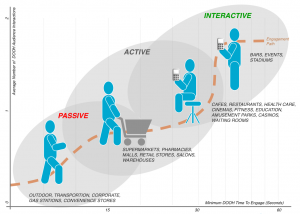
Fig.1. Mapping Place-Based Social Media to Channels (Click to enlarge).
For short dwell times, or content slots of a maximum of 15 seconds, I’d recommend using passive place-based social media (e.g. displaying localized Twitter messages about a city, sports/team or news.) Zoom Media and Marketing Sport’s Bites and RMG Networks’ NYTimesToday.com are examples of passive applications built by LocaModa designed to grab attention and inform and/or entertain. True to their passive nature, these applications do not have call to action so do not support any DOOH user interactions.
For longer dwell times and content slots of 15-30 seconds, DOOH networks can use active place-based social media that support user participation features, subject to the capabilities of the DOOH network. As previously described, active place-based social media can be influenced by the DOOH audience but not in real time – either due to limitations of infrastructure or time required by brands/venues to ensure content is adequately filtered, moderated and/or curated. Example applications include trending Twitter topics or changes in existing accounts such as celebrities, to show which celebrities are more or less popular. Such applications can be used in supermarket check-out lines to entertain shoppers as described in this post about LocaModa and PRN.)
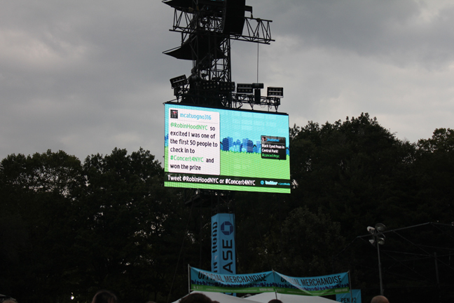
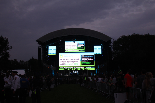
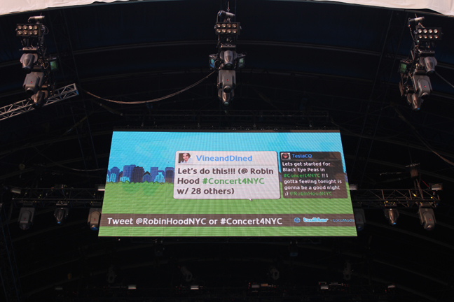
For long dwell times and content slots over 30 seconds, DOOH networks can use interactive place-based social media. Interactive applications include real-time Twitter, text/photo-to-screen, real-time polls, and check-ins (e.g. displaying check-in info and tips for services such as Foursquare, Facebook Places or Gowalla). Well designed and inexpensive moderation/curation tools make interactive applications easy to deploy these days.
There are plenty of application examples available via the LocaModa App Store and there will be more examples and information in the white paper which I’m aiming to finish before the end of this month.